A note on xicor
Introduction
From reading [1], I know that Professor Sourav Chatterjee has published a paper about a new correlation called $xicor$, and I read [2].
Not like Pearson’s correlation $r$, which measures linear (or monotonic) relationship between random variables $X$ and $Y$, $xicor(X, Y)$ measures how much $Y$ is functionally related to $X$. Notice that $xicor(X, Y)$ is not the same as $xicor(Y, X)$.
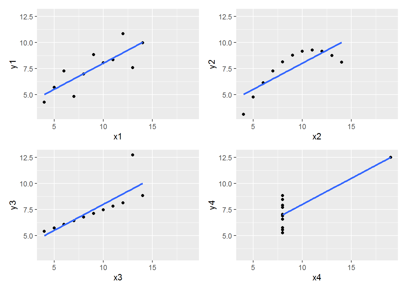
After looking through [2], my first thought is to give $xicor$ a try on the famous data set, Anscombe’s quartet (see [3]).
R code and results
Firstly, let’s have a look at the data set:
(datasets::anscombe)
##    x1 x2 x3 x4    y1   y2    y3    y4
## 1  10 10 10  8  8.04 9.14  7.46  6.58
## 2   8  8  8  8  6.95 8.14  6.77  5.76
## 3  13 13 13  8  7.58 8.74 12.74  7.71
## 4   9  9  9  8  8.81 8.77  7.11  8.84
## 5  11 11 11  8  8.33 9.26  7.81  8.47
## 6  14 14 14  8  9.96 8.10  8.84  7.04
## 7   6  6  6  8  7.24 6.13  6.08  5.25
## 8   4  4  4 19  4.26 3.10  5.39 12.50
## 9  12 12 12  8 10.84 9.13  8.15  5.56
## 10  7  7  7  8  4.82 7.26  6.42  7.91
## 11  5  5  5  8  5.68 4.74  5.73  6.89
Next we plot the data
library(dplyr)
library(ggplot2)
library(patchwork)

# a helper function
my_plot <- function(vec1, vec2, i = 1, x_L, x_U, y_L, y_U)
{df <- data.frame(x = vec1, y = vec2)

 p <-
   df %>%
   ggplot(aes(x, y)) +
   geom_point() +
   geom_smooth(method = "lm", se = FALSE) +
   labs(x = paste0("x", i), y = paste0("y", i)) +
   scale_x_continuous(limits = c(x_L, x_U)) +
   scale_y_continuous(limits = c(y_L, y_U))
 p
}

# x limits
min_x <- min(anscombe$x1, anscombe$x2, anscombe$x3, anscombe$x4)
max_x <- max(anscombe$x1, anscombe$x2, anscombe$x3, anscombe$x4)

# y limits
min_y <- min(anscombe$y1, anscombe$y2, anscombe$y3, anscombe$y4)
max_y <- max(anscombe$y1, anscombe$y2, anscombe$y3, anscombe$y4)

# four pictures
p1 <- my_plot(anscombe$x1, anscombe$y1, 1,
              x_L = min_x, x_U = max_x, y_L = min_y, y_U = max_y)
p2 <- my_plot(anscombe$x2, anscombe$y2, 2,
              x_L = min_x, x_U = max_x, y_L = min_y, y_U = max_y)
p3 <- my_plot(anscombe$x3, anscombe$y3, 3,
              x_L = min_x, x_U = max_x, y_L = min_y, y_U = max_y)
p4 <- my_plot(anscombe$x4, anscombe$y4, 4,
              x_L = min_x, x_U = max_x, y_L = min_y, y_U = max_y)

(the_plot <- (p1 | p2) / (p3 | p4))

Thirdly, we find out the Pearson’s correlation $r$ for each pair of x and y in the data set.
library(purrr)
df1 <- anscombe[, 1:4]
df2 <- anscombe[, 5:8]
r <- map2_dbl(df1, df2, cor)
names(r) <- c("r1", "r2", "r3", "r4")
r
##        r1        r2        r3        r4
## 0.8164205 0.8162365 0.8162867 0.8165214
If we keep two decimal places, then the $r$’s are all equal to $0.82$.
Finally, we calculate the $xicor$ for each pair of x and y in the data set.
library(XICOR)

xicor_xy <- rep(0, 4)
xicor_yx <- rep(0, 4)

for(i in 1:4)
{x <- anscombe[, i]
 y <- anscombe[, i + 4]
 xicor_xy[i] <- calculateXI(x, y)
 xicor_yx[i] <- calculateXI(y, x)
}

(list(xicor_xy, xicor_yx))
## [[1]]
## [1]  0.275  0.600  0.725 -0.075
##
## [[2]]
## [1] 0.250 0.225 0.725 0.450
References
[1] URL: https://www.r-bloggers.com/2021/12/how-to-read-sourav-chatterjees-basic-xicor-definition/
[2] Chatterjeeurl, S. A New Coefficient Of Correlation. URL: https://arxiv.org/pdf/1909.10140.pdf